 03-背景与渐变
# 背景基础知识
# 背景颜色基础知识
background-color 属性
background-color: rgba(0,0,0,.5);
1
- background-color 属性表示背景颜色
- 背景颜色可以用十六进制、rgb()、rgba() 表示法表示
- padding 区域是有背景颜色的
# 背景图片基础知识
background-image 属性
background-image: url(images/bg1.jpg);
1
- background-image 属性用来设置背景图片,图片路径要写到 url() 圆括号中,可以是相对路径,也可以是 http:// 开头的绝对路径
- 如果 css 是外链的(
link引入),那么要书写从 CSS 出发到图片的路径,而不是从 html 出发
# 背景图片高级属性
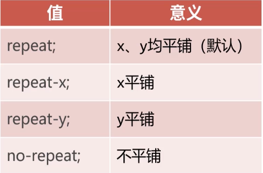
# 背景图片的重复模式
background-repeat 属性,用来设置背景的重复模式值
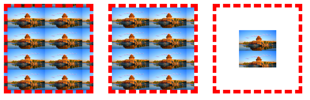
# 背景尺寸
(1)background-size
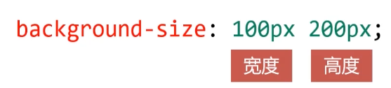
- background-size 属性用来设置背景图片的尺寸,兼容到 lE9
- 值也可以用百分数来设置,表示为盒子宽、高的百分之多少
- 需要等比例设置的值,写 auto
div {
    width: 500px;
    height: 300px;
    border: 1px solid #000;
    background-image: url(images/0.jpg);
}
.box1 {
    /* 背景尺寸,宽度300px,高度auto */
    background-size: 300px auto;
}
.box2 {
    /* 背景图片横向×4 */
    background-size: 25% auto;
}
.box2 {
    /* 背景图片4×4(不固定比例) */
    background-size: 25% 25%;
}
1
2
3
4
5
6
7
8
9
10
11
12
13
14
15
16
17
18
2
3
4
5
6
7
8
9
10
11
12
13
14
15
16
17
18
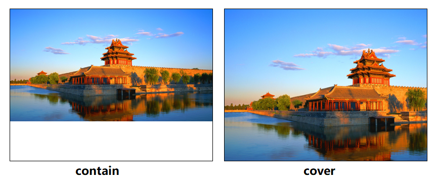
(2)cantain 和 cover
- contain 和 cover 是两个特殊的 background-size 的值
- contain 表示将背景图片智能改变尺寸以容纳到盒子里(先放最大一张,然后再考虑重复)
- cover 表示将背景图片智能改变尺寸以撑满盒子(拉伸)
.box3 {
    background-image: url(images/0.jpg);
    background-repeat: no-repeat;
    /* 背景尺寸 */
    background-size: contain;
}
.box4 {
    background-image: url(images/0.jpg);
    background-repeat: no-repeat;
    /* 背景尺寸 */
    background-size: cover;
}
1
2
3
4
5
6
7
8
9
10
11
12
2
3
4
5
6
7
8
9
10
11
12
# 背景裁切
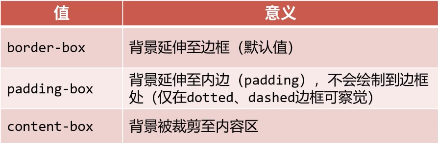
background-clip 属性用来设置元素的背景裁切到哪个盒子,兼容到 IE9。
<!DOCTYPE html>
<html lang="en">
<head>
    <meta charset="UTF-8">
    <meta name="viewport" content="width=device-width, initial-scale=1.0">
    <title>Document</title>
    <style>
        div {
            float: left;
            width: 100px;
            height: 100px;
            border: 10px dashed rgb(255, 0, 0);
            margin: 20px;
            padding: 60px;
            background-image: url(images/0.jpg);
            background-size: 100px auto;
        }
        .box1 {
            /* 背景延申至边框(默认) */
            background-clip: border-box;
        }
        .box2 {
            /* 背景裁切到padding区域 */
            background-clip: padding-box;
        }
        .box3 {
            /* 背景裁切到内容区域 */
            background-clip: content-box;
            /* 背景起源 */
            background-origin: content-box;
        }
    </style>
</head>

<body>
    <div class="box1"></div>
    <div class="box2"></div>
    <div class="box3"></div>
</body>
</html>
1
2
3
4
5
6
7
8
9
10
11
12
13
14
15
16
17
18
19
20
21
22
23
24
25
26
27
28
29
30
31
32
33
34
35
36
37
38
39
40
2
3
4
5
6
7
8
9
10
11
12
13
14
15
16
17
18
19
20
21
22
23
24
25
26
27
28
29
30
31
32
33
34
35
36
37
38
39
40
background-origin: content-box表示背景图片从右上角开始渲染。
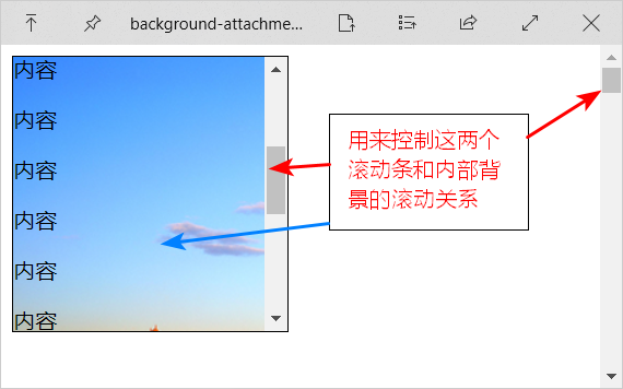
# 背景固定
background-attachment 属性决定背景图像的位置是在视口内固定,或者随着包含它的区块滚动。
<!DOCTYPE html>
<html lang="en">
<head>
    <meta charset="UTF-8">
    <meta name="viewport" content="width=device-width, initial-scale=1.0">
    <title>Document</title>
    <style>
        .box1 {
            width: 200px;
            height: 200px;
            border: 1px solid #000;
            /* 纵向溢出的内容,用滚动条显示 */
            overflow-y: scroll;
            background-image: url(images/0.jpg);
        }
        body {
            height: 3000px;
        }
    </style>
</head>
<body>
    <div class="box1">
        <p>内容</p>
        <p>内容</p>
        <p>内容</p>
        <p>内容</p>
        <p>内容</p>
        <p>内容</p>
        <p>内容</p>
        <p>内容</p>
        <p>内容</p>
        <p>内容</p>
        <p>内容</p>
        <p>内容</p>
    </div>
</body>
</html>
1
2
3
4
5
6
7
8
9
10
11
12
13
14
15
16
17
18
19
20
21
22
23
24
25
26
27
28
29
30
31
32
33
34
35
36
37
2
3
4
5
6
7
8
9
10
11
12
13
14
15
16
17
18
19
20
21
22
23
24
25
26
27
28
29
30
31
32
33
34
35
36
37
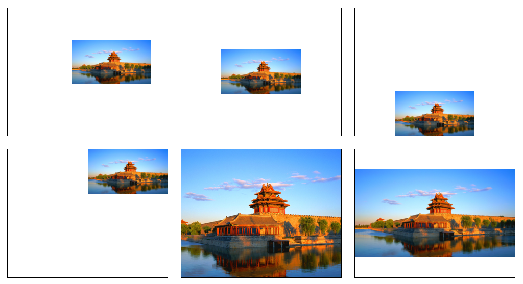
# 背景图片位置
background-position 属性可以设置背景图片出现在盒子的什么位置。
- 可以使用像素描述定位
- 也可以用 top、bottom、center、left、right 描述图片出现的位置(好用)
<!DOCTYPE html>
<html lang="en">
<head>
    <meta charset="UTF-8">
    <meta name="viewport" content="width=device-width, initial-scale=1.0">
    <title>Document</title>
    <style>
        div {
            float: left;
            width: 250px;
            height: 200px;
            border: 1px solid #000;
            margin: 10px;
            background-image: url(images/0.jpg);
            background-repeat: no-repeat;
            background-size: 50% auto;
        }
        .box1 {
            /* 使用像素定位 */
            background-position: 100px 50px;
        }
        .box2 {
            /* 居中 */
            background-position: center center;
        }
        .box3 {
            /* 中下 */
            background-position: center bottom;
        }
        .box4 {
            /* 右上 */
            background-position: right top;
        }
        .box5 {
            background-size: cover;
            /* 配合cover,展示图片中央 */
            background-position: center center;
        }
        .box6 {
            background-size: contain;
            /* 配合contain,实现平分空隙 */
            background-position: center center;
        }
    </style>
</head>
<body>
    <div class="box1"></div>
    <div class="box2"></div>
    <div class="box3"></div>
    <div class="box4"></div>
    <div class="box5"></div>
    <div class="box6"></div>
</body>
</html>
1
2
3
4
5
6
7
8
9
10
11
12
13
14
15
16
17
18
19
20
21
22
23
24
25
26
27
28
29
30
31
32
33
34
35
36
37
38
39
40
41
42
43
44
45
46
47
48
49
50
51
52
53
54
2
3
4
5
6
7
8
9
10
11
12
13
14
15
16
17
18
19
20
21
22
23
24
25
26
27
28
29
30
31
32
33
34
35
36
37
38
39
40
41
42
43
44
45
46
47
48
49
50
51
52
53
54
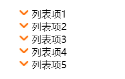
# (案例) CSS精灵
CSS 精灵:将多个小图标合并制作到一张图片上,使用 background-position,属性单独显示其中一个。这样的技术叫做 CSS 精灵技术,也叫作 CSS 雪碧图。
CSS 精灵可以减少 HTTP 请求数,加快网页显示速度。缺点也很明显:不方便测量、后期改动麻烦。
下面使用 示例图片 来演示使用,我们需要这张图中 (0, 12px) 处的图标。
<!DOCTYPE html>
<html lang="en">
<head>
    <meta charset="UTF-8">
    <meta name="viewport" content="width=device-width, initial-scale=1.0">
    <title>Document</title>
    <style>
        ul {
            list-style: none;
        }
        ul li {
            position: relative;
            padding-left: 20px;
        }
        i.dg {
            position: absolute;
            top: 5px;
            left: 0;
            /* 使用CSS精灵作背景图片 */
            background-image: url(images/sprites.png);
            /* 锁定图标在背景图片中的位置 */
            background-position: 0 -12px;
            /* 固定宽高和图标一致 */
            width: 14px;
            height: 8px;
        }
    </style>
</head>
<body>
    <ul>
        <li><i class="dg"></i>列表项1</li>
        <li><i class="dg"></i>列表项2</li>
        <li><i class="dg"></i>列表项3</li>
        <li><i class="dg"></i>列表项4</li>
        <li><i class="dg"></i>列表项5</li>
    </ul>
</body>
</html>
1
2
3
4
5
6
7
8
9
10
11
12
13
14
15
16
17
18
19
20
21
22
23
24
25
26
27
28
29
30
31
32
33
34
35
36
37
38
2
3
4
5
6
7
8
9
10
11
12
13
14
15
16
17
18
19
20
21
22
23
24
25
26
27
28
29
30
31
32
33
34
35
36
37
38
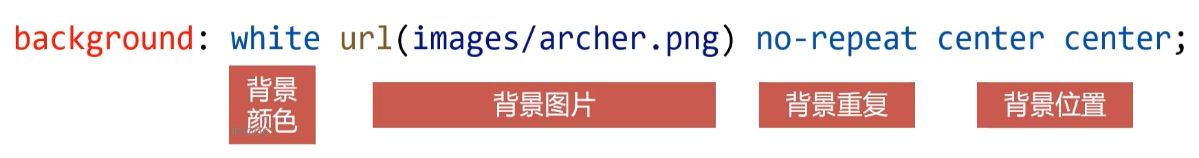
# background综合属性
一些常用的背景相关小属性,可以合写到一条 background 属性中。
.box {
    width: 500px;
    height: 400px;
    border: 1px solid #000;
    background: yellow url(images/archer.png) no-repeat center center;
}
1
2
3
4
5
6
2
3
4
5
6
# 渐变背景
# 线性渐变
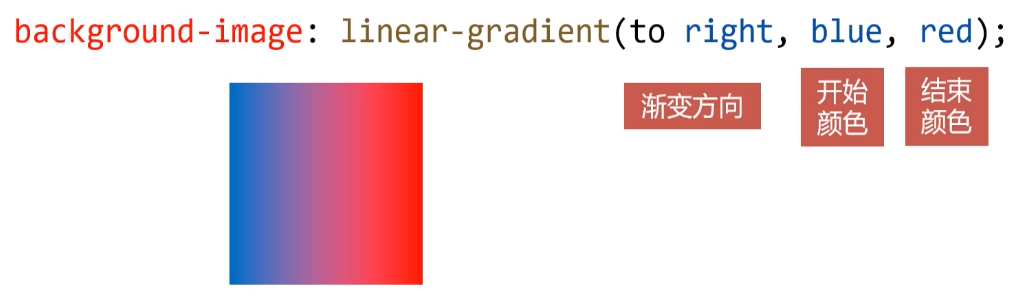
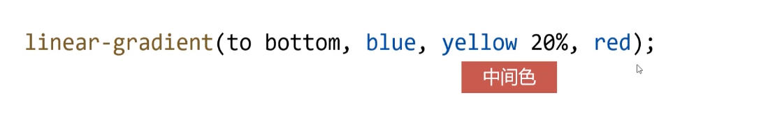
盒子的 background-image 属性可以用 linear-gradient() 形式创建线性渐变背景。
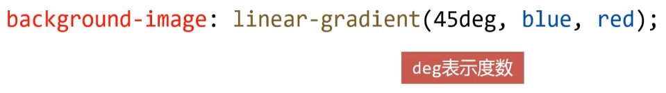
渐变方向也可以写成度数。
可以有多个颜色值,并且可以用百分数定义它们出现的位置。
示例:
<!DOCTYPE html>
<html lang="en">
<head>
<meta charset="UTF-8">
<meta name="viewport" content="width=device-width, initial-scale=1.0">
<title>Document</title>
<style>
div {
float: left;
width: 150px;
height: 150px;
border: 1px solid #000;
margin: 10px;
}
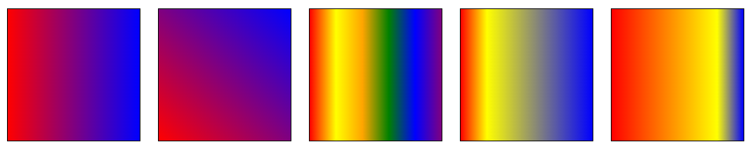
.box1 {
background-image: linear-gradient(to right, red, blue);
/* 浏览器私有前缀 */
background-image: -webkit-linear-gradient(to right, red, blue);
background-image: -moz-linear-gradient(to right, red, blue);
background-image: -ms-linear-gradient(to right, red, blue);
background-image: -o-linear-gradient(to right, red, blue);
}
.box2 {
background-image: linear-gradient(45deg, red, blue);
}
.box3 {
background-image: linear-gradient(to right, red, yellow, orange, green, blue, purple);
}
.box4 {
background-image: linear-gradient(to right, red, yellow 20%, blue);
}
.box5 {
background-image: linear-gradient(to right, red, yellow 80%, blue);
}
</style>
</head>
<body>
<div class="box1"></div>
<div class="box2"></div>
<div class="box3"></div>
<div class="box4"></div>
<div class="box5"></div>
</body>
</html>
1
2
3
4
5
6
7
8
9
10
11
12
13
14
15
16
17
18
19
20
21
22
23
24
25
26
27
28
29
30
31
32
33
34
35
36
37
38
39
40
41
42
43
44
45
46
2
3
4
5
6
7
8
9
10
11
12
13
14
15
16
17
18
19
20
21
22
23
24
25
26
27
28
29
30
31
32
33
34
35
36
37
38
39
40
41
42
43
44
45
46
浏览器私有前缀:不同浏览器有不同的私有前缀,用来对试验性质的CSS属性加以标识。
- Chrome:-webkit-
- Firefox:-moz-
- IE、Edge:-ms-
- 欧朋:-o-
后期 nodejs 有很多智能化工具,能自动帮我们解决这些私有化前缀。
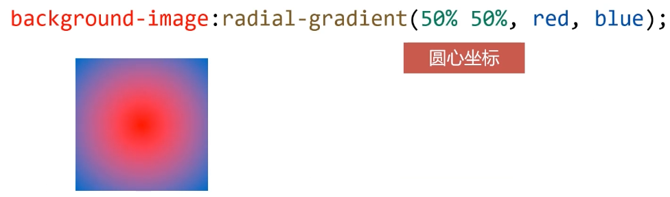
# 径向渐变
盒子的 background-image 属性可以用 radial-gradient() 形式创建径向渐变背景
.box {
    width: 200px;
    height: 200px;
    border: 1px solid #000;
    background-image: radial-gradient(50% 50%, red, blue, yellow);
}
1
2
3
4
5
6
2
3
4
5
6
编辑 (opens new window)
上次更新: 2023/06/04, 12:34:19