 01-过渡与动画
# 过渡
# 过渡的基本使用
# 过渡属性transition
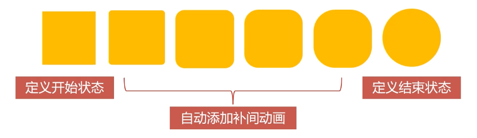
transition 过渡属性是 CSS3 浓墨重彩的特性,过渡可以为一个元素在不同样式之间变化自动添加 “补间动画”。常与 hover 等配合触发过渡。
- 过渡从 IE10 开始兼容,移动端兼容良好
- 曾几何时,网页上的动画特效基本都是由 JavaScript 定时器实现的,现在逐步改为使用 CSS3 过渡
- 优点:动画更细腻,内存开销小
transition 属性有 4 个要素:
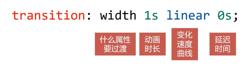
- 过渡属性:什么属性需要参与过渡
- 动画时长:过渡动画的动效时长
- 变化速度曲线:实例中 linear 表示匀速
- 延迟时间:经过多长时间开始过渡
# 哪些属性可以参与过渡
- 所有数值类型的属性,都可以参与过渡,比如 width、height、left、top、border-radius
- 背景颜色和文字颜色都可以被过渡
- 所有变形(包括 2D 和 3D)都能被过渡
示例:
<!DOCTYPE html>
<html lang="en">
<head>
    <meta charset="UTF-8">
    <meta name="viewport" content="width=device-width, initial-scale=1.0">
    <title>Document</title>
    <style>
        * {
            margin: 0;
            padding: 0;
        }
        div {
            width: 200px;
            height: 200px;
            background-color: orange;
            margin-bottom: 10px;

        }

        /* 宽度过渡 */
        .box1 {
            transition: width 1s linear 0s;
        }
        .box1:hover {
            width: 500px;
        }

        /* 布局位置过渡 */
        .box2 p {
            position: relative;
            width: 100px;
            height: 100px;
            background-color: red;
            transition: left 1s linear 0s;
            left: 0;
        }
        .box2:hover p {
            left: 300px;
        }

        /* 颜色过渡 */
        .box3 {
            transition: background-color 1s linear 0s;
        }
        .box3:hover {
            background-color: green;
        }

        /* 圆角过渡 */
        .box4 {
            border-radius: 0;
            transition: border-radius 1s linear 0s;
        }
        .box4:hover {
            border-radius: 50%;
        }

        /* 2D形变过渡 */
        .box5 {
            transition: transform 1s linear 0s;
        }
        .box5:hover {
            transform: scale(1.2) rotate(360deg);
        }

        /* 3D形变过渡 */
        .box6 {
            perspective: 300px;
        }
        .box6 p {
            width: 100px;
            height: 100px;
            background-color: red;
            transition: transform 1s linear 0s;
        }
        .box6:hover p {
            transform: rotateX(360deg) rotateY(360deg);
        }

        /* all过渡 */
        .box7 {
            border-radius: 0;
            transition: all 1s linear 0s;
        }
        .box7:hover {
            width: 400px;
            height: 160px;
            background-color: green;
            border-radius: 50%;
        }
    </style>
</head>

<body>
    <div class="box1">宽度过渡</div>
    <div class="box2">
        <p>布局位置过渡</p>
    </div>
    <div class="box3">颜色过渡</div>
    <div class="box4">圆角过渡</div>
    <div class="box5">2D形变过渡</div>
    <div class="box6">
        <p>3D形变过渡</p>
    </div>
    <div class="box7">all过渡</div>
</body>
</html>
1
2
3
4
5
6
7
8
9
10
11
12
13
14
15
16
17
18
19
20
21
22
23
24
25
26
27
28
29
30
31
32
33
34
35
36
37
38
39
40
41
42
43
44
45
46
47
48
49
50
51
52
53
54
55
56
57
58
59
60
61
62
63
64
65
66
67
68
69
70
71
72
73
74
75
76
77
78
79
80
81
82
83
84
85
86
87
88
89
90
91
92
93
94
95
96
97
98
99
100
101
102
103
104
105
106
107
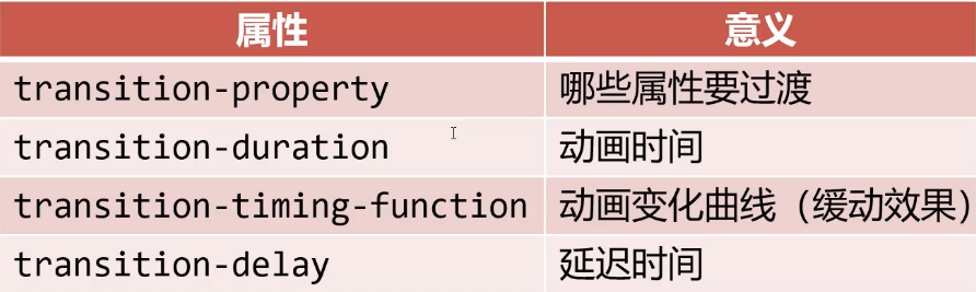
# 过渡的四个小属性
transition 属性的四个值,分别对应四个小属性,小属性的作用和前面介绍的边框小属性一样,为了覆盖大属性。
# 过渡的缓动效果
transition 的第三个参数就是缓动参数,也是变化速度曲线,对应的小属性是 transition-timing-function。
前面介绍过匀速 linear,此外还有以下可选项,曲线越陡表示过渡越快。
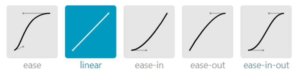
缓动效果还可以通过贝塞尔曲线来描述。网站 https:/cubic-bezier.com/ (opens new window) 可以生成贝塞尔曲线,自定义动画缓动参数。

<!DOCTYPE html>
<html lang="en">
<head>
    <meta charset="UTF-8">
    <meta name="viewport" content="width=device-width, initial-scale=1.0">
    <title>Document</title>
    <style>
        * {
            margin: 0;
            padding: 0;
        }
        .box {
            border: 1px solid #000;
        }
        .box p {
            width: 60px;
            height: 60px;
            background-color: orange;
            margin-bottom: 10px;
            position: relative;
            left: 0;
            transition: left 5s linear 0s;
        }

        /* 使用小属性覆盖大属性,为p配置不同的缓动效果 */
        .box p:nth-child(2) {
            transition-timing-function: ease;
        }
        .box p:nth-child(3) {
            transition-timing-function: ease-in;
        }
        .box p:nth-child(4) {
            transition-timing-function: ease-out;
        }
        .box p:nth-child(5) {
            transition-timing-function: ease-in-out;
        }
        .box p:nth-child(6) {
            /* 贝塞尔曲线 */
            transition-timing-function: cubic-bezier(.29,-0.98,.5,1.76);
        }

        .box:hover p {
            left: 1000px;
        }
    </style>
</head>
<body>
    <div class="box">
        <p></p>
        <p></p>
        <p></p>
        <p></p>
        <p></p>
        <p></p>
    </div>
</body>
</html>
1
2
3
4
5
6
7
8
9
10
11
12
13
14
15
16
17
18
19
20
21
22
23
24
25
26
27
28
29
30
31
32
33
34
35
36
37
38
39
40
41
42
43
44
45
46
47
48
49
50
51
52
53
54
55
56
57
58
2
3
4
5
6
7
8
9
10
11
12
13
14
15
16
17
18
19
20
21
22
23
24
25
26
27
28
29
30
31
32
33
34
35
36
37
38
39
40
41
42
43
44
45
46
47
48
49
50
51
52
53
54
55
56
57
58
# 过渡效果实战
# (案例)图片标题淡入淡出
<!DOCTYPE html>
<html lang="en">

<head>
    <meta charset="UTF-8">
    <meta name="viewport" content="width=device-width, initial-scale=1.0">
    <title>Document</title>
    <style>
        * {
            margin: 0;
            padding: 0;
        }

        .box {
            width: 1200px;
            overflow: hidden;
            margin: 40px auto;
        }

        .box ul {
            list-style: none;
        }

        .box ul li {
            float: left;
            width: 380px;
            height: 210px;
            margin-right: 20px;
            /* 子绝父相 */
            position: relative;
        }

        .box ul li img {
            width: 380px;
            height: 210px;
        }

        .box ul li .info {
            position: absolute;
            width: 370px;
            height: 30px;
            line-height: 30px;
            color: white;
            bottom: 0;
            padding-left: 10px;
            background-color: rgba(0, 0, 0, .5);
            /* 透明度设置为0,不是背景的透明度,而是整体的透明度 */
            opacity: 0;
            /* 过渡 */
            transition: opacity 1s ease 0s;
        }

        /* 当li被触碰的时候,内部的info盒子就要把透明度变为1 */
        .box ul li:hover .info {
            opacity: 1;
        }
    </style>
</head>

<body>
    <div class="box">
        <ul>
            <li>
                <img src="images/0.jpg" alt="">
                <div class="info">北京的故宫</div>
            </li>
            <li>
                <img src="images/1.jpg" alt="">
                <div class="info">鸟巢国家体育场</div>
            </li>
            <li>
                <img src="images/2.jpg" alt="">
                <div class="info">十七孔桥</div>
            </li>
        </ul>
    </div>
</body>

</html>
1
2
3
4
5
6
7
8
9
10
11
12
13
14
15
16
17
18
19
20
21
22
23
24
25
26
27
28
29
30
31
32
33
34
35
36
37
38
39
40
41
42
43
44
45
46
47
48
49
50
51
52
53
54
55
56
57
58
59
60
61
62
63
64
65
66
67
68
69
70
71
72
73
74
75
76
77
78
79
2
3
4
5
6
7
8
9
10
11
12
13
14
15
16
17
18
19
20
21
22
23
24
25
26
27
28
29
30
31
32
33
34
35
36
37
38
39
40
41
42
43
44
45
46
47
48
49
50
51
52
53
54
55
56
57
58
59
60
61
62
63
64
65
66
67
68
69
70
71
72
73
74
75
76
77
78
79
# (案例)图标放大旋转动效
<!DOCTYPE html>
<html lang="en">

<head>
    <meta charset="UTF-8">
    <meta name="viewport" content="width=device-width, initial-scale=1.0">
    <title>Document</title>
    <style>
        * {
            margin: 0;
            padding: 0;
        }

        .box {
            width: 508px;
            height: 107px;
            margin: 40px auto;
        }

        .box ul {
            list-style: none;
        }

        .box ul li {
            float: left;
            width: 107px;
            height: 107px;
            margin-right: 20px;
            /* 子绝父相 */
            position: relative;
        }

        .box ul li::before {
            content: '';
            display: block;
            width: 107px;
            height: 107px;
            transform: rotate(0);
            transition: transform 1s ease 0s;
        }

        .box ul li:nth-child(1)::before {
            background-image: url(images/a_1.png);
        }

        .box ul li:nth-child(2)::before {
            background-image: url(images/a_2.png);
        }

        .box ul li:nth-child(3)::before {
            background-image: url(images/a_3.png);
        }

        .box ul li:nth-child(4)::before {
            background-image: url(images/a_4.png);
        }

        .box ul li img {
            position: absolute;
            width: 60px;
            height: 60px;
            top: 50%;
            left: 50%;
            margin-left: -30px;
            margin-top: -30px;
            transition: transform .5s ease 0s;
        }

        /* 背景圆环旋转一周 */
        .box ul li:hover::before {
            transform: rotate(360deg);
        }

        /* 中心图标放大1.2倍 */
        .box ul li:hover img {
            transform: scale(1.2);
        }
    </style>
</head>

<body>
    <div class="box">
        <ul>
            <li>
                <img src="images/icon1.svg" alt="">
            </li>
            <li>
                <img src="images/icon2.svg" alt="">
            </li>
            <li>
                <img src="images/icon3.svg" alt="">
            </li>
            <li>
                <img src="images/icon4.svg" alt="">
            </li>
        </ul>
    </div>
</body>

</html>
1
2
3
4
5
6
7
8
9
10
11
12
13
14
15
16
17
18
19
20
21
22
23
24
25
26
27
28
29
30
31
32
33
34
35
36
37
38
39
40
41
42
43
44
45
46
47
48
49
50
51
52
53
54
55
56
57
58
59
60
61
62
63
64
65
66
67
68
69
70
71
72
73
74
75
76
77
78
79
80
81
82
83
84
85
86
87
88
89
90
91
92
93
94
95
96
97
98
99
100
2
3
4
5
6
7
8
9
10
11
12
13
14
15
16
17
18
19
20
21
22
23
24
25
26
27
28
29
30
31
32
33
34
35
36
37
38
39
40
41
42
43
44
45
46
47
48
49
50
51
52
53
54
55
56
57
58
59
60
61
62
63
64
65
66
67
68
69
70
71
72
73
74
75
76
77
78
79
80
81
82
83
84
85
86
87
88
89
90
91
92
93
94
95
96
97
98
99
100
# (案例)翻盖动效
<!DOCTYPE html>
<html lang="en">

<head>
    <meta charset="UTF-8">
    <meta name="viewport" content="width=device-width, initial-scale=1.0">
    <title>Document</title>
    <style>
        * {
            margin: 0;
            padding: 0;
        }

        .box {
            width: 200px;
            height: 200px;
            margin: 40px auto;
            perspective: 500px;
            position: relative;
        }

        .box img {
            width: 200px;
            height: 200px;
            border: 1px solid #000;
            border-radius: 50%;
        }

        .box img.dog {
            position: absolute;
            top: 0;
            left: 0;
            transform-origin: 0 0;
            transition: transform 1s ease 0s;
        }

        .box:hover img.dog {
            transform: rotateY(-180deg);
        }

        .no2 img.dog {
            transform-origin: 100% 100%;
        }

        .no2:hover img.dog {
            transform: rotateY(180deg);
        }

        .no3 img.dog {
            transform-origin: 0 0;
        }

        .no3:hover img.dog {
            transform: rotateX(180deg);
        }
    </style>
</head>

<body>
    <div class="box">
        <img class="cat" src="images/cat.jpg" alt="">
        <img class="dog" src="images/dog.jpg" alt="">
    </div>

    <div class="box no2">
        <img class="cat" src="images/cat.jpg" alt="">
        <img class="dog" src="images/dog.jpg" alt="">
    </div>

    <div class="box no3">
        <img class="cat" src="images/cat.jpg" alt="">
        <img class="dog" src="images/dog.jpg" alt="">
    </div>
</body>

</html>
1
2
3
4
5
6
7
8
9
10
11
12
13
14
15
16
17
18
19
20
21
22
23
24
25
26
27
28
29
30
31
32
33
34
35
36
37
38
39
40
41
42
43
44
45
46
47
48
49
50
51
52
53
54
55
56
57
58
59
60
61
62
63
64
65
66
67
68
69
70
71
72
73
74
75
76
2
3
4
5
6
7
8
9
10
11
12
13
14
15
16
17
18
19
20
21
22
23
24
25
26
27
28
29
30
31
32
33
34
35
36
37
38
39
40
41
42
43
44
45
46
47
48
49
50
51
52
53
54
55
56
57
58
59
60
61
62
63
64
65
66
67
68
69
70
71
72
73
74
75
76
# (案例)正方体3D旋转
<!DOCTYPE html>
<html lang="en">

<head>
    <meta charset="UTF-8">
    <meta name="viewport" content="width=device-width, initial-scale=1.0">
    <title>Document</title>
    <style>
        * {
            margin: 0;
            padding: 0;
        }

        section {
            width: 200px;
            height: 200px;
            margin: 100px auto;
            perspective: 10000px;
        }
        .box {
            width: 200px;
            height: 200px;
            perspective: 10000px;
            position: relative;
            /* 设置变形类型,保留它内部的3D效果 */
            /* 这个盒子又是舞台,又是演员,这个box整体带着里面的p旋转 */
            transform-style: preserve-3d;
            transition:all 10s ease 0s;
        }

        section:hover .box {
            transform: rotateX(360deg) rotateY(360deg);
        }

        .box p {
            position: absolute;
            top: 0;
            left: 0;
            width: 200px;
            height: 200px;
        }

        .box p:nth-child(1) {
            background-color: rgba(219, 56, 211, 0.486);
            /* 前面 */
            transform: translateZ(100px);
        }

        .box p:nth-child(2) {
            background-color: rgba(42, 128, 199, 0.486);
            /* 顶面 */
            transform: rotateX(90deg) translateZ(100px);
        }

        .box p:nth-child(3) {
            background-color: rgba(56, 219, 83, 0.486);
            /* 背面 */
            transform: rotateX(180deg) translateZ(100px);
        }

        .box p:nth-child(4) {
            background-color: rgba(213, 216, 32, 0.486);
            /* 底面 */
            transform: rotateX(-90deg) translateZ(100px);
        }

        .box p:nth-child(5) {
            background-color: rgba(236, 82, 102, 0.486);
            /* 侧面 */
            transform: rotateY(90deg) translateZ(100px);
        }

        .box p:nth-child(6) {
            background-color: rgba(119, 17, 236, 0.486);
            /* 侧面 */
            transform: rotateY(-90deg) translateZ(100px);
        }
    </style>
</head>

<body>
    <section>
        <div class="box">
            <p></p>
            <p></p>
            <p></p>
            <p></p>
            <p></p>
            <p></p>
        </div>
    </section>
</body>

</html>
1
2
3
4
5
6
7
8
9
10
11
12
13
14
15
16
17
18
19
20
21
22
23
24
25
26
27
28
29
30
31
32
33
34
35
36
37
38
39
40
41
42
43
44
45
46
47
48
49
50
51
52
53
54
55
56
57
58
59
60
61
62
63
64
65
66
67
68
69
70
71
72
73
74
75
76
77
78
79
80
81
82
83
84
85
86
87
88
89
90
91
92
93
94
2
3
4
5
6
7
8
9
10
11
12
13
14
15
16
17
18
19
20
21
22
23
24
25
26
27
28
29
30
31
32
33
34
35
36
37
38
39
40
41
42
43
44
45
46
47
48
49
50
51
52
53
54
55
56
57
58
59
60
61
62
63
64
65
66
67
68
69
70
71
72
73
74
75
76
77
78
79
80
81
82
83
84
85
86
87
88
89
90
91
92
93
94
# 动画
# 动画的定义和调用
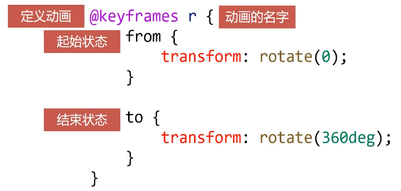
# 动画的定义
CSS3 可以直接定义动画,不需要配合 hover 触碰就可以自动执行,要比过渡来的更自动写。
使用 @keyframes 来定义动画,keyframes 表示 “关键帧”,就像 flush 一样定义起始帧和结束帧就可以自动补全动画一样。
在项目上线前,要补上@-webkit- 这样的私有前缀。
# 动画的调用
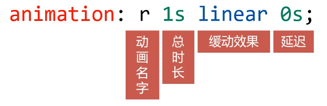
定义动画之后,就可以使用 animation 属性调用动画。
基本参数
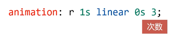
动画的执行次数
第五个参数就是动画的执行次数
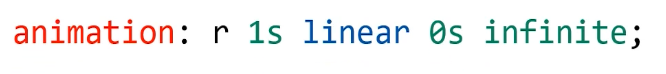
如果想永远执行可以写 infinite
如果想让动画的第 2、4、6…(偶数次)自动逆向执行,那 么要加上 alternate 参数即可

如果想让动画停止在最后结束状态,那么要加上 forwards

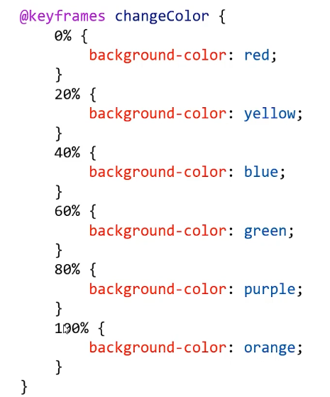
# 多关键帧动画
前面只介绍了 @keyframes 中定义起始帧 from 和结束帧 to,其实还可以定义多关键帧动画,下图表示在动画周期中,不同时间的关键帧。如在经过 20% 时间时应该是黄色。
示例:
<!DOCTYPE html>
<html lang="en">

<head>
    <meta charset="UTF-8">
    <meta name="viewport" content="width=device-width, initial-scale=1.0">
    <title>Document</title>
    <style>
        .box1 {
            width: 200px;
            height: 200px;
            background-color: orange;
            /* 动画调用 */
            animation: r 1s linear 0s infinite 3;
        }
        /* 动画定义,旋转 */
        @keyframes r {
            from {
                transform: rotate(0);
            }
            to {
                transform: rotate(360deg);
            }
        }

        .box2 {
            width: 200px;
            height: 200px;
            background-color: blue;
            animation: movelr 2s linear 0s infinite alternate;
        }
        /* 移动 */
        @keyframes movelr {
            from {
                transform: translateX(0);
            }
            to {
                transform: translateX(1000px);
            }
        }

        .box3 {
            width: 200px;
            height: 200px;
            background-color: green;
            animation: changeToCircle 1s linear 0s forwards;
        }
        /* 圆角 */
        @keyframes changeToCircle {
            from {
                border-radius: 0;
            }
            to {
                border-radius: 50%;
            }
        }

        .box4 {
            width: 200px;
            height: 200px;
            background-color: red;
            animation: changeColor 3s linear 0s alternate infinite;
        }
        /* 多关键帧动画:颜色变化 */
        @keyframes changeColor {
            0% {
                background-color: red;
            }
            20% {
                background-color: yellow;
            }
            40% {
                background-color: blue;
            }
            60% {
                background-color: green;
            }
            80% {
                background-color: purple;
            }
            100% {
                background-color: orange;
            }
        }
    </style>
</head>

<body>
    <div class="box1"></div>
    <div class="box2"></div>
    <div class="box3"></div>
    <div class="box4"></div>
</body>

</html>
1
2
3
4
5
6
7
8
9
10
11
12
13
14
15
16
17
18
19
20
21
22
23
24
25
26
27
28
29
30
31
32
33
34
35
36
37
38
39
40
41
42
43
44
45
46
47
48
49
50
51
52
53
54
55
56
57
58
59
60
61
62
63
64
65
66
67
68
69
70
71
72
73
74
75
76
77
78
79
80
81
82
83
84
85
86
87
88
89
90
91
92
93
94
95
2
3
4
5
6
7
8
9
10
11
12
13
14
15
16
17
18
19
20
21
22
23
24
25
26
27
28
29
30
31
32
33
34
35
36
37
38
39
40
41
42
43
44
45
46
47
48
49
50
51
52
53
54
55
56
57
58
59
60
61
62
63
64
65
66
67
68
69
70
71
72
73
74
75
76
77
78
79
80
81
82
83
84
85
86
87
88
89
90
91
92
93
94
95
# 动画效果实战
# (案例)发光灯泡和穿梭的火箭
<!DOCTYPE html>
<html lang="en">
<head>
    <meta charset="UTF-8">
    <meta name="viewport" content="width=device-width, initial-scale=1.0">
    <title>Document</title>
    <style>
        * {
            margin: 0;
            padding: 0;
        }
        .dengpao {
            position: absolute;
            top: 300px;
            left: 300px;
        }
        .guang {
            position: absolute;
            top: 235px;
            left: 222px;
            animation: ss 1s ease 0s infinite alternate;
        }

        @keyframes ss {
            from {
                opacity: 1;
            }
            to {
                opacity: 0;
            }
        }

        .huojian {
            position: absolute;
            top: 300px;
            left: 800px;
            animation: zd .4s linear 0s infinite alternate;
        }

        @keyframes zd {
            from {
                transform: translateX(-20px) translateY(-20px);
            }
            to {
                transform: translateX(20px) translateY(20px);
            }
        }

        .line1 {
            width: 2px;
            height: 166px;
            background-color: blue;
            position: absolute;
            top: 300px;
            left: 800px;
            transform: rotate(45deg);
            animation: yd 1s linear 0s infinite;
            opacity: 0;
        }
        .line2 {
            width: 2px;
            height: 266px;
            background-color: blue;
            position: absolute;
            top: 340px;
            left: 850px;
            transform: rotate(45deg);
            animation: yd 1s linear .4s infinite;
            opacity: 0;
        }
        .line3 {
            width: 2px;
            height: 266px;
            background-color: blue;
            position: absolute;
            top: 390px;
            left: 890px;
            transform: rotate(45deg);
            animation: yd 1s linear .68s infinite;
            opacity: 0;
        }
        .line4 {
            width: 2px;
            height: 266px;
            background-color: blue;
            position: absolute;
            top: 390px;
            left: 920px;
            transform: rotate(45deg);
            animation: yd 1s linear .2s infinite;
            opacity: 0;
        }
        @keyframes yd {
            0% {
                transform: rotate(45deg) translateY(-300px);
                opacity: 0;
            }
            50% {
                opacity: 1;
            }
            100% {
                transform: rotate(45deg) translateY(300px);
                opacity: 0;
            }
        }
    </style>
</head>
<body>
    <img class="dengpao" src="images/dengpao.png" alt="">
    <img class="guang" src="images/guang.png" alt="">

    <img class="huojian" src="images/huojian.png" alt="">
    <div class="line1"></div>
    <div class="line2"></div>
    <div class="line3"></div>
    <div class="line4"></div>
</body>
</html>
1
2
3
4
5
6
7
8
9
10
11
12
13
14
15
16
17
18
19
20
21
22
23
24
25
26
27
28
29
30
31
32
33
34
35
36
37
38
39
40
41
42
43
44
45
46
47
48
49
50
51
52
53
54
55
56
57
58
59
60
61
62
63
64
65
66
67
68
69
70
71
72
73
74
75
76
77
78
79
80
81
82
83
84
85
86
87
88
89
90
91
92
93
94
95
96
97
98
99
100
101
102
103
104
105
106
107
108
109
110
111
112
113
114
115
116
117
118
编辑 (opens new window)
上次更新: 2023/06/04, 12:34:19