 01-浮动与定位
# 浮动
# 浮动的基本概念
# 浮动的功能
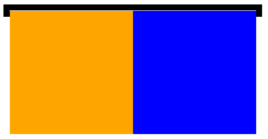
浮动的本质功能:用来实现并排
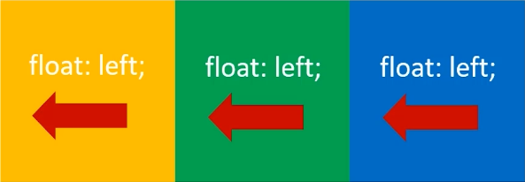
浮动使用要点:
- 要浮动,并排的盒子都要设置浮动
- 父盒子要有足够的宽度,否则子盒子会掉下去
<!DOCTYPE html>
<html lang="en">
<head>
    <meta charset="UTF-8">
    <meta name="viewport" content="width=device-width, initial-scale=1.0">
    <title>Document</title>
    <style>
        .box {
            width: 600px;
            height: 200px;
            border: 1px solid #000;
        }
        .box .c1 {
            width: 200px;
            height: 200px;
            background-color: orange;
            float: left;
        }
        .box .c2 {
            width: 200px;
            height: 200px;
            background-color: green;
            float: left;
        }
        .box .c3 {
            width: 200px;
            height: 200px;
            background-color: blue;
            float: left;
        }
    </style>
</head>
<body>
    <div class="box">
        <div class="c1"></div>
        <div class="c2"></div>
        <div class="c3"></div>
    </div>
</body>
</html>
1
2
3
4
5
6
7
8
9
10
11
12
13
14
15
16
17
18
19
20
21
22
23
24
25
26
27
28
29
30
31
32
33
34
35
36
37
38
39
40
2
3
4
5
6
7
8
9
10
11
12
13
14
15
16
17
18
19
20
21
22
23
24
25
26
27
28
29
30
31
32
33
34
35
36
37
38
39
40
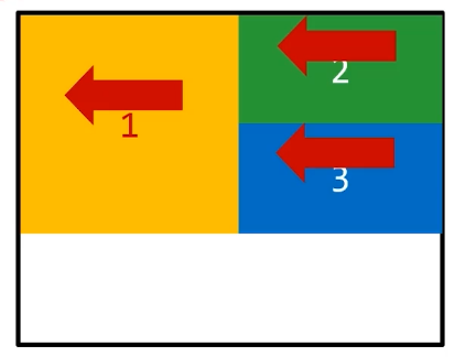
# 浮动的顺序贴靠特
子盒子会按顺序进行贴靠,如果没有足够空间,则会寻找再前一个兄弟元素
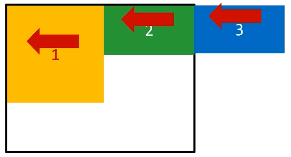
子盒子会按顺序进行贴靠,如果没有足够空间,则会寻找再前一个兄弟元素
<!DOCTYPE html>
<html lang="en">
<head>
    <meta charset="UTF-8">
    <meta name="viewport" content="width=device-width, initial-scale=1.0">
    <title>Document</title>
    <style>
        .box{
            width: 250px;
            height: 100px;
            border: 1px solid #000;
        }
        .box .c1 {
            width: 150px;
            height: 100px;
            background-color: orange;
            float: left;
        }
        .box .c2 {
            width: 100px;
            height: 50px;
            background-color: green;
            float: left;
        }
        .box .c3 {
            width: 100px;
            height: 50px;
            background-color: blue;
            float: left;
        }
    </style>
</head>
<body>
    <div class="box">
        <div class="c1"></div>
        <div class="c2"></div>
        <div class="c3"></div>
    </div>
</body>
</html>
1
2
3
4
5
6
7
8
9
10
11
12
13
14
15
16
17
18
19
20
21
22
23
24
25
26
27
28
29
30
31
32
33
34
35
36
37
38
39
40
2
3
4
5
6
7
8
9
10
11
12
13
14
15
16
17
18
19
20
21
22
23
24
25
26
27
28
29
30
31
32
33
34
35
36
37
38
39
40
# 浮动的元素一定能没置宽高
浮动的元素不再区分块级元素、行内元素,已经脱离了标准文档流,一律能够设置宽度和高度,即使它是 span 或者 a 标签等慕课网
<!DOCTYPE html>
<html lang="en">
<head>
    <meta charset="UTF-8">
    <meta name="viewport" content="width=device-width, initial-scale=1.0">
    <title>Document</title>
    <style>
        span {
            float: left;
            width: 100px;
            height: 30px;
            background-color: orange;
            margin-right: 10px;
        }
    </style>
</head>
<body>
    <span>1</span>
    <span>2</span>
    <span>3</span>
    <span>4</span>
</body>
</html>
1
2
3
4
5
6
7
8
9
10
11
12
13
14
15
16
17
18
19
20
21
22
23
2
3
4
5
6
7
8
9
10
11
12
13
14
15
16
17
18
19
20
21
22
23
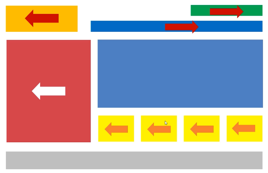
# 使用浮动实现网页布局
<!DOCTYPE html>
<html lang="en">
<head>
    <meta charset="UTF-8">
    <meta name="viewport" content="width=device-width, initial-scale=1.0">
    <title>Document</title>
    <style>
        *{
            margin: 0;
            padding: 0;
        }
        header{
            width: 1000px;
            height: 100px;
            margin: 0 auto;
        }
        .content{
            width: 1000px;
            height: 500px;
            margin: 20px auto;
        }
        footer{
            width: 1000px;
            height: 100px;
            margin: 0px auto;
            background-color: #333;
        }
        header .logo{
            float: left;
            width: 220px;
            height: 100px;
            background-color: orange;
        }
        header .login{
            float: right;
            width: 220px;
            height: 30px;
            background-color: orange;
        }
        nav {
            float: right;
            width: 690px;
            height: 50px;
            margin-top: 20px;
            background-color: green;
        }
        .content .ad{
            float: left;
            width: 300px;
            height: 500px;
            background-color: rgb(9, 141, 182);
        }
        .content main{
            float: right;
            width: 680px;
            height: 500px;
        }
        .content main .banner {
            width: 680px;
            height: 380px;
            background-color: orange;
        }
        .content main .pics {
            width: 680px;
            height: 100px;
            margin-top: 20px;
        }
        .content main .pics ul {
            list-style: none;
        }
        .content main .pics ul li{
            float: left;
            width: 160px;
            height: 100px;
            background-color: blue;
            margin-right: 10px;
        }
        .content main .pics ul li:last-child {
            width: 170px;
            margin-right: 0;
        }
    </style>
</head>
<body>
    <header>
        <div class="logo"></div>
        <div class="login"></div>
        <nav></nav>
    </header>
    <section class="content">
        <aside class="ad"></aside>
        <main>
            <div class="banner"></div>
            <div class="pics">
                <ul>
                    <li></li>
                    <li></li>
                    <li></li>
                    <li></li>
                </ul>
            </div>
        </main>
    </section>
    <footer></footer>
</body>
</html>
1
2
3
4
5
6
7
8
9
10
11
12
13
14
15
16
17
18
19
20
21
22
23
24
25
26
27
28
29
30
31
32
33
34
35
36
37
38
39
40
41
42
43
44
45
46
47
48
49
50
51
52
53
54
55
56
57
58
59
60
61
62
63
64
65
66
67
68
69
70
71
72
73
74
75
76
77
78
79
80
81
82
83
84
85
86
87
88
89
90
91
92
93
94
95
96
97
98
99
100
101
102
103
104
105
106
# BFC规范和浏览器差异
# BFC规范
BFC(Box Formatting Context,块级格式化上下文)是页面上的一个隔离的独立容器,容器里面的子元素不会影响到外面的元素,反之亦然。
从一个现象开始说起
<!DOCTYPE html>
<html lang="en">
<head>
    <meta charset="UTF-8">
    <meta name="viewport" content="width=device-width, initial-scale=1.0">
    <title>Document</title>
    <style>
        .box {
            width: 400px;
            border: 10px solid #000;
        }
        .box .c1{
            width: 200px;
            height: 200px;
            background-color: orange;
            float: left;
        }
        .box .c2{
            width: 200px;
            height: 200px;
            background-color: blue;
            float: left;
        }
    </style>
</head>
<body>
    <div class="box">
        <div class="c1"></div>
        <div class="c2"></div>
    </div>
</body>
</html>
1
2
3
4
5
6
7
8
9
10
11
12
13
14
15
16
17
18
19
20
21
22
23
24
25
26
27
28
29
30
31
32
2
3
4
5
6
7
8
9
10
11
12
13
14
15
16
17
18
19
20
21
22
23
24
25
26
27
28
29
30
31
32
现象:一个盒子不设置 height,当内容子元素都浮动时,无法撑起自身。
原因:这个父盒子 box 没有形成 BFC
如何使父盒子形成 BFC 呢:
- 方法①:float 的值不是 none(让父盒子和浮动,不推荐)
- 方法②:position 的值不是 static 或者 relative(定位后面讲解)
- 方法③:display 的值是 inline-block、flex 或者 inline-flex(改变了父盒子的属性,不推荐)
- 方法④:overflow: hidden;
.box {
    width: 400px;
    border: 10px solid #000;

    /* 方法① */
    /* float: left; */

    /* 方法② */
    /* display: inline-block; */

    /* 方法④ */
    overflow: hidden;
}
1
2
3
4
5
6
7
8
9
10
11
12
13
2
3
4
5
6
7
8
9
10
11
12
13
# BFC的其他作用
- BFC 可以取消盒子 margin 塌陷
- BFC 可以可以阻止元素被浮动元素覆盖
<!DOCTYPE html>
<html lang="en">
<head>
    <meta charset="UTF-8">
    <meta name="viewport" content="width=device-width, initial-scale=1.0">
    <title>Document</title>
    <style>
        * {
            margin: 0;
            padding: 0;
        }
        p {
            width: 200px;
            height: 200px;
            background-color: orange;
            margin: 50px;
        }
        div {
            /* 取消了 margin 上下塌陷 */
            overflow: hidden;
        }
        .s1 {
            float: left;
            width: 300px;
            height: 300px;
            background-color: red;
        }
        .s2 {
            /* s2 没有浮动,也不会被浮动的 s1 覆盖 */
            /* 不规范,演示用,实际编码应该让 s2 浮动 */
            overflow: hidden;
            width: 200px;
            height: 200px;
            background-color: blue;
        }
    </style>
</head>

<body>
    <div>
        <p></p>
    </div>
    <div>
        <p></p>
    </div>

    <section class="s1"></section>
    <section class="s2"></section>
</body>
</html>
1
2
3
4
5
6
7
8
9
10
11
12
13
14
15
16
17
18
19
20
21
22
23
24
25
26
27
28
29
30
31
32
33
34
35
36
37
38
39
40
41
42
43
44
45
46
47
48
49
50
2
3
4
5
6
7
8
9
10
11
12
13
14
15
16
17
18
19
20
21
22
23
24
25
26
27
28
29
30
31
32
33
34
35
36
37
38
39
40
41
42
43
44
45
46
47
48
49
50
# 浏览器差异
- IE6、7 浏览器使用 haslayout 机制,和 BFC 规范略有差异,比如 lE 浏览器可以使用 zoom:1 属性 “让盒子拥有 layout”
- 如果要制作兼容到 IE6、7 的网页时,尽量让网页布局变得简单,内部有浮动的盒子要设置 height 属性,规范编程,不要 “玩杂技”
# 定位
# 相对定位
相对定位:盒子可以相对自己原来的位置进行位置调整,称为相对定位
这个原来的位置,就是不使用
position时的位置
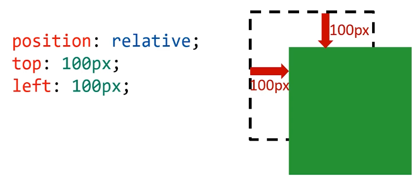
位置描述词
- left 向右移动;right 向左移动;top 向下移动;bottom 向上移动
- 值可以为负数,即往规定方向相反移动
相对定位的性质
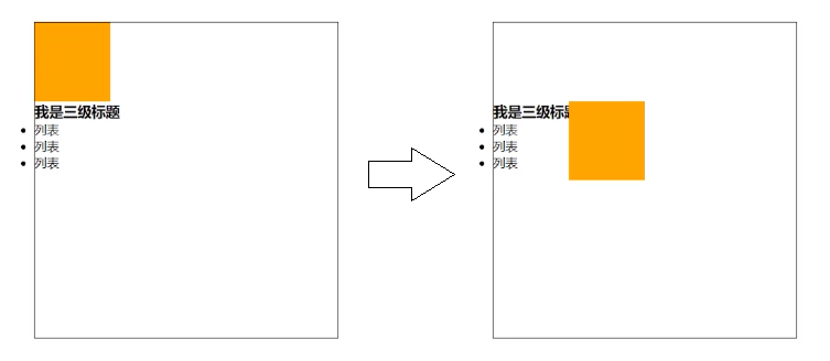
相对定位的元素,会在 “老家留坑”,本质上仍然是在原来的位置,只不过渲染在新的地方而已,渲染的图形可以比喻成 “影子”,不会对页面其他元素产生任何影响。
比如下例中 p 标签使用了先对定位,挪到了其他地方,但是原来的地方并不会空出来,所以写在后面的列表上面空出了 p 标签原来的位置。
<!DOCTYPE html>
<html lang="en">
<head>
    <meta charset="UTF-8">
    <meta name="viewport" content="width=device-width, initial-scale=1.0">
    <title>Document</title>
    <style>
        *{
            margin: 0;
            padding: 0;
        }
        div {
            width: 400px;
            height: 400px;
            border: 1px solid #000;
            margin: 40px auto;
        }
        p {
            width: 100px;
            height: 100px;
            background-color: orange;
            /* 使用了相对定位 */
            position: relative;
            top: 100px;
            left: 100px;
        }
    </style>
</head>
<body>
    <div>
        <p></p>
        <h3>我是三级标题</h3>
        <ul>
            <li>列表</li>
            <li>列表</li>
            <li>列表</li>
        </ul>
    </div>
</body>
</html>
1
2
3
4
5
6
7
8
9
10
11
12
13
14
15
16
17
18
19
20
21
22
23
24
25
26
27
28
29
30
31
32
33
34
35
36
37
38
39
40
2
3
4
5
6
7
8
9
10
11
12
13
14
15
16
17
18
19
20
21
22
23
24
25
26
27
28
29
30
31
32
33
34
35
36
37
38
39
40
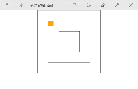
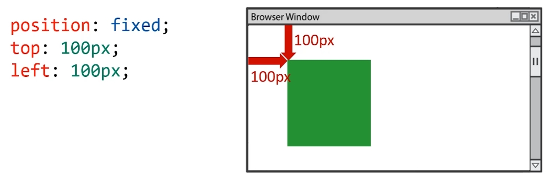
# 绝对定位
# 绝对定位性质
绝对定位:盒子可以在浏览器中以坐标进行位置精准描述,拥有自己的绝对位置
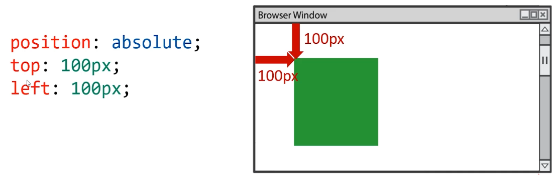
位置描述词
- left 到左边的距离;right 到右边的距离;top 到上边的距离;bottom 到下边的距离
- 左右选一个,上下选一个,共两个描述词即可
绝对定位性质
- 绝对定位的元素脱离标准文档流,将释放自己的位置,对其他元素不会产生任何干扰,而是对它们进行压盖。
- 绝对定位的盒子并不是永远以浏览器作为基准点
- 绝对定位的盒子会以自己祖先元素中,离自己最近的拥有定位属性的盒子,当做基准点。这个盒子通常是相对定位的,所以这个性质也叫作 “子绝父相”
<!DOCTYPE html>
<html lang="en">
<head>
    <meta charset="UTF-8">
    <meta name="viewport" content="width=device-width, initial-scale=1.0">
    <title>Document</title>
    <style>
        *{
            margin: 0;
            padding: 0;
        }
        .box1{
            width: 402px;
            height: 402px;
            border: 1px solid #000;
            padding: 100px;
            margin: 0 auto;
        }
        .box2 {
            width: 200px;
            height: 200px;
            padding: 100px;
            border: 1px solid #000;
            position: relative;
        }
        .box3 {
            width: 98px;
            height: 98px;
            padding: 50px;
            border: 1px solid #000;
        }
        p {
            width: 50px;
            height: 50px;
            background-color: orange;
            position: absolute;
            top: 0;
            left: 0;
        }
    </style>
</head>
<body>
    <div class="box1">
        <div class="box2">
            <div class="box3">
                <p></p>
            </div>
        </div>
    </div>
</body>
</html>
1
2
3
4
5
6
7
8
9
10
11
12
13
14
15
16
17
18
19
20
21
22
23
24
25
26
27
28
29
30
31
32
33
34
35
36
37
38
39
40
41
42
43
44
45
46
47
48
49
50
51
2
3
4
5
6
7
8
9
10
11
12
13
14
15
16
17
18
19
20
21
22
23
24
25
26
27
28
29
30
31
32
33
34
35
36
37
38
39
40
41
42
43
44
45
46
47
48
49
50
51
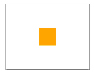
# 绝对定位的盒子垂直居中
绝对定位的盒子垂直居中是一个非常实用的技术
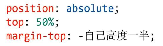
position: absolute;
top: 50%;
margin-top: -自己高度一半;
/* 水平居中同理 */
left: 50%;
margin-left: -自己宽度一半;
1
2
3
4
5
6
2
3
4
5
6
这里为什么水平居中不使用 mrigin: 0 auto 呢?因为使用绝对定位后元素就脱离标准文档流了,就不能使用 margin 调整定位了。
<!DOCTYPE html>
<html lang="en">
<head>
    <meta charset="UTF-8">
    <meta name="viewport" content="width=device-width, initial-scale=1.0">
    <title>Document</title>
    <style>
        * {
            margin: 0;
            padding: 0;
        }

        div {
            width: 400px;
            height: 300px;
            border: 1px solid #000;
            margin: 40px auto;
            position: relative;
        }

        p {
            width: 80px;
            height: 80px;
            background-color: orange;
            /* 绝对定位使元素居中 */
            position: absolute;
            top: 50%;
            left: 50%;
            margin-top: -40px;
            margin-left: -40px;
        }
    </style>
</head>

<body>
    <div>
        <p></p>
    </div>
</body>
</html>
1
2
3
4
5
6
7
8
9
10
11
12
13
14
15
16
17
18
19
20
21
22
23
24
25
26
27
28
29
30
31
32
33
34
35
36
37
38
39
40
2
3
4
5
6
7
8
9
10
11
12
13
14
15
16
17
18
19
20
21
22
23
24
25
26
27
28
29
30
31
32
33
34
35
36
37
38
39
40
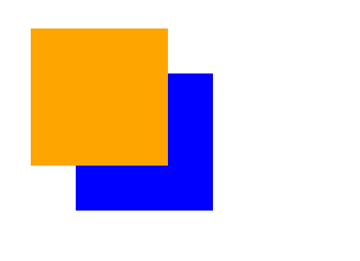
# 堆叠顺序z-index属性
z-index 属性是一个没有单位的正整数,数值大的能够压住数值小的,可以理解为图层。
<!DOCTYPE html>
<html lang="en">
<head>
    <meta charset="UTF-8">
    <meta name="viewport" content="width=device-width, initial-scale=1.0">
    <title>Document</title>
    <style>
        .box1 {
            width: 300px;
            height: 300px;
            background-color: orange;
            position: absolute;
            top: 100px;
            left: 100px;
            z-index: 9999;
        }

        .box2 {
            width: 300px;
            height: 300px;
            background-color: blue;
            position: absolute;
            top: 200px;
            left: 200px;
            z-index: 999;
        }
    </style>
</head>

<body>
    <div class="box1"></div>
    <div class="box2"></div>
</body>
</html>
1
2
3
4
5
6
7
8
9
10
11
12
13
14
15
16
17
18
19
20
21
22
23
24
25
26
27
28
29
30
31
32
33
34
2
3
4
5
6
7
8
9
10
11
12
13
14
15
16
17
18
19
20
21
22
23
24
25
26
27
28
29
30
31
32
33
34
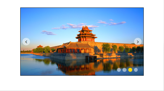
# 绝对定位的用途
- 绝对定位用来制作 “压盖”、“遮罩” 效果
- 绝对定位用来结合 CSS 精灵使用
- 绝对定位可以结合 JS 实现动画
# (案例) 绝对定位实现轮播图样式
<!DOCTYPE html>
<html lang="en">
<head>
<meta charset="UTF-8">
<meta name="viewport" content="width=device-width, initial-scale=1.0">
<title>Document</title>
<style>
* {
margin: 0;
padding: 0;
}
.carousel {
width: 650px;
height: 360px;
border: 1px solid #000;
margin: 40px auto;
position: relative;
}
.carousel .btn {
position: absolute;
width: 40px;
height: 40px;
margin-top: -20px;
top: 50%;
/* 圆形 */
border-radius: 50%;
text-align: center;
line-height: 40px;
background-color: rgba(255, 255, 255, .5);
/* 鼠标为小手 */
cursor: pointer;
font-family: consolas;
font-size: 26px;
}
.carousel .btn:hover {
background-color: gold;
color: white;
}
.carousel .leftbtn {
left: 10px;
}
.carousel .rightbtn {
right: 10px;
}
.carousel ol {
position: absolute;
width: 120px;
height: 20px;
right: 20px;
bottom: 20px;
list-style: none;
}
.carousel ol li {
float: left;
width: 20px;
height: 20px;
background-color: rgba(255, 255, 255, .5);
/* 变为圆形 */
border-radius: 50%;
margin-right: 10px;
}
.carousel ol li.current {
background-color: gold;
}
</style>
</head>
<body>
<div class="carousel">
<img src="images/0.jpg" alt="">
<a class="leftbtn btn"><</a>
<a class="rightbtn btn">></a>
<ol>
<li></li>
<li></li>
<li class="current"></li>
<li></li>
</ol>
</div>
</body>
</html>
1
2
3
4
5
6
7
8
9
10
11
12
13
14
15
16
17
18
19
20
21
22
23
24
25
26
27
28
29
30
31
32
33
34
35
36
37
38
39
40
41
42
43
44
45
46
47
48
49
50
51
52
53
54
55
56
57
58
59
60
61
62
63
64
65
66
67
68
69
70
71
72
73
74
75
76
77
78
79
80
81
82
83
84
85
86
87
88
2
3
4
5
6
7
8
9
10
11
12
13
14
15
16
17
18
19
20
21
22
23
24
25
26
27
28
29
30
31
32
33
34
35
36
37
38
39
40
41
42
43
44
45
46
47
48
49
50
51
52
53
54
55
56
57
58
59
60
61
62
63
64
65
66
67
68
69
70
71
72
73
74
75
76
77
78
79
80
81
82
83
84
85
86
87
88
# 固定定位
固定定位:不管页面如何卷动,它永远固定在那里
固定定位性质
- 固定定位只能以浏览器页面为参考点,没有子固父相这个性质
- 固定定位脱离标准文档流
固定定位的用途:“返回顶部”、“楼层导航”
编辑 (opens new window)
上次更新: 2023/06/04, 12:34:19