 04-2D与3D转换
# 2D形变
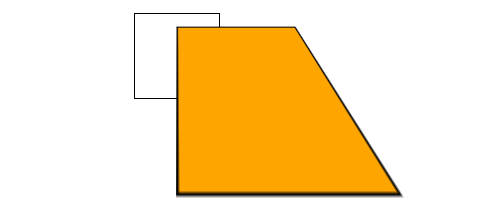
# 旋转形变

将
transform属性的值设置为rotate(),即可实现旋转变形。若角度为正,则顺时针方向旋转,否则逆时针方向旋转。
默认围绕几何中间旋转,可以使用
transform-origin属性指定旋转中心。2D形变都可以使用
transform-origin来指定形变中心。
<!DOCTYPE html>
<html lang="en">
<head>
    <meta charset="UTF-8">
    <meta name="viewport" content="width=device-width, initial-scale=1.0">
    <title>Document</title>
    <style>
        img{
            border: 1px solid #000;
        }
        .pic1 {
            /* 围绕几何中心顺时针30° */
            transform: rotate(30deg);
        }
        .pic2 {
            /* 围绕左上角逆时针30° */
            transform-origin: 0 0;
            transform: rotate(-30deg);
        }
    </style>
</head>
<body>
    <img src="images/goblin.png" class="pic1">
    <img src="images/goblin.png" class="pic2">
</body>
</html>
1
2
3
4
5
6
7
8
9
10
11
12
13
14
15
16
17
18
19
20
21
22
23
24
25
26
2
3
4
5
6
7
8
9
10
11
12
13
14
15
16
17
18
19
20
21
22
23
24
25
26
# 缩放形变
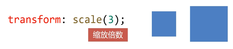
- 将 transform 属性的值设置为 scale(),即可实现缩放变形。
- 当数值小于 1 时,表示缩小元素;大于 1 表示放大元素。
# 斜切形变
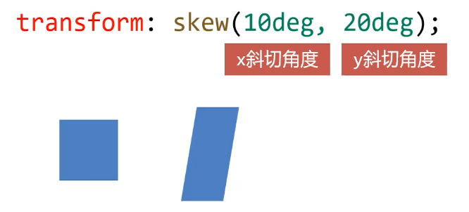
- 将 transform 属性的值设置为 skew(),即可实现斜切变形
# 位移形变
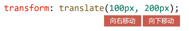
- 将 transform 属性的值设置为 translate(),即可实现位移变形
- 和相对定位非常像,位移变形也会 “老家留坑”,“形影分离”
# 3D形变
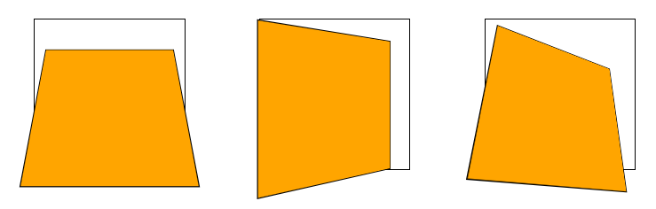
# 3D旋转
将
transform属性的值设置为rotateX()或者rotateY(),即可实现绕横轴、纵轴旋转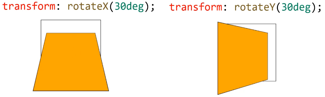
perspective属性,用来定义透视强度,可以理解为 “人眼到舞台的距离”,单位是 px。3D 旋转必须设置该属性,否则失效。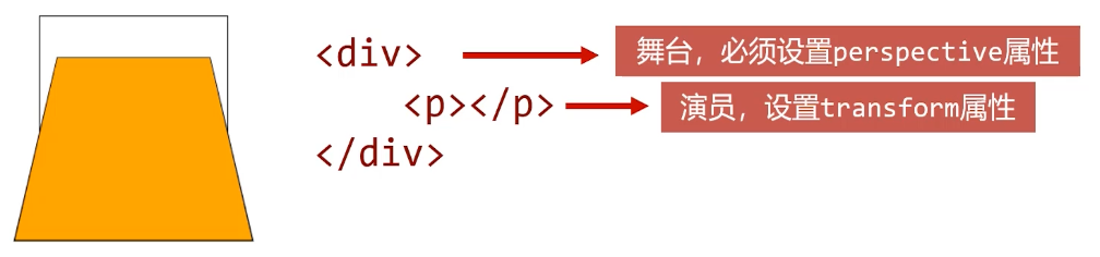
示例:
<!DOCTYPE html>
<html lang="en">
<head>
    <meta charset="UTF-8">
    <meta name="viewport" content="width=device-width, initial-scale=1.0">
    <title>Document</title>
    <style>
        div {
            float: left;
            margin: 50px;
            width: 202px;
            height: 202px;
            border: 1px solid #000;
        }
        p {
            width: 200px;
            height: 200px;
            border: 1px solid #000;
            background-color: orange;
        }

        .box1 {
            /* 舞台必须设置该属性 */
            perspective: 300px;
        }
        .box1 p {
            /* 旋转度数 */
            transform: rotateX(30deg);
        }

        .box2 {
            perspective: 300px;
        }
        .box2 p {
            transform: rotateY(30deg);
        }

        .box3 {
            perspective: 300px;
        }
        .box3 p {
            transform: rotateX(30deg) rotateY(30deg);
        }
    </style>
</head>

<body>
    <div class="box1">
        <p></p>
    </div>
    <div class="box2">
        <p></p>
    </div>
    <div class="box3">
        <p></p>
    </div>
</body>
</html>
1
2
3
4
5
6
7
8
9
10
11
12
13
14
15
16
17
18
19
20
21
22
23
24
25
26
27
28
29
30
31
32
33
34
35
36
37
38
39
40
41
42
43
44
45
46
47
48
49
50
51
52
53
54
55
56
57
58
2
3
4
5
6
7
8
9
10
11
12
13
14
15
16
17
18
19
20
21
22
23
24
25
26
27
28
29
30
31
32
33
34
35
36
37
38
39
40
41
42
43
44
45
46
47
48
49
50
51
52
53
54
55
56
57
58
# 空间移动
- 当元素进行 3D 旋转后,即可继续添加 translateX()、translateY()、translateZ() 属性让元素在空间进行移动
- 一定记住,空间移动要添加在3D旋转之后
示例:
<!DOCTYPE html>
<html lang="en">
<head>
    <meta charset="UTF-8">
    <meta name="viewport" content="width=device-width, initial-scale=1.0">
    <title>Document</title>
    <style>
        p {
            width: 200px;
            height: 200px;
            border: 1px solid #000;
            background-color: orange;
        }
        .box1 {
            width: 202px;
            height: 202px;
            border: 1px solid #000;
            margin: 50px auto;
            perspective: 300px;
        }
        .box1 p {
            transform: rotateX(30deg) translateX(100px) translateY(100px) translateZ(100px);
        }
    </style>
</head>

<body>
    <div class="box1">
        <p></p>
    </div>
</body>
</html>
1
2
3
4
5
6
7
8
9
10
11
12
13
14
15
16
17
18
19
20
21
22
23
24
25
26
27
28
29
30
31
32
2
3
4
5
6
7
8
9
10
11
12
13
14
15
16
17
18
19
20
21
22
23
24
25
26
27
28
29
30
31
32
# (案例) 制作正方体
这是一个透视正方体,隧道的形式,黑色的线是基准正方形,上下左右面贴住基准面的边并垂直于它。前后面分别平行于基准面。
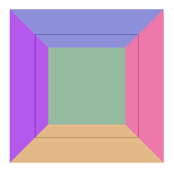
代码中,外层 div 是面,六个 p 是正方体六个面。
<!DOCTYPE html>
<html lang="en">
<head>
    <meta charset="UTF-8">
    <meta name="viewport" content="width=device-width, initial-scale=1.0">
    <title>Document</title>
    <style>
        * {
            margin: 0;
            padding: 0;
        }

        /* 基准面 */
        .box {
            width: 200px;
            height: 200px;
            border: 1px solid #000;
            margin: 100px auto;
            perspective: 300px;
            position: relative;
        }

        .box p {
            position: absolute;
            top: 0;
            left: 0;
            width: 200px;
            height: 200px;
        }

        /* 前面 */
        .box p:nth-child(1) {
            background-color: rgba(219, 56, 211, 0.486);
            transform: translateZ(100px);
        }
        /* 后面 */
        .box p:nth-child(3) {
            background-color: rgba(56, 219, 83, 0.486);
            transform: rotateX(180deg) translateZ(100px);
        }
        /* 顶面 */
        .box p:nth-child(2) {
            background-color: rgba(42, 128, 199, 0.486);
            transform: rotateX(90deg) translateZ(100px);
        }
        /* 底面 */
        .box p:nth-child(4) {
            background-color: rgba(213, 216, 32, 0.486);
            transform: rotateX(-90deg) translateZ(100px);
        }
        /* 左面 */
        .box p:nth-child(6) {
            background-color: rgba(119, 17, 236, 0.486);
            transform: rotateY(-90deg) translateZ(100px);
        }
        /* 右面 */
        .box p:nth-child(5) {
            background-color: rgba(236, 82, 102, 0.486);
            transform: rotateY(90deg) translateZ(100px);
        }
    </style>
</head>

<body>
    <div class="box">
        <p></p>
        <p></p>
        <p></p>
        <p></p>
        <p></p>
        <p></p>
    </div>
</body>
</html>
1
2
3
4
5
6
7
8
9
10
11
12
13
14
15
16
17
18
19
20
21
22
23
24
25
26
27
28
29
30
31
32
33
34
35
36
37
38
39
40
41
42
43
44
45
46
47
48
49
50
51
52
53
54
55
56
57
58
59
60
61
62
63
64
65
66
67
68
69
70
71
72
73
74
2
3
4
5
6
7
8
9
10
11
12
13
14
15
16
17
18
19
20
21
22
23
24
25
26
27
28
29
30
31
32
33
34
35
36
37
38
39
40
41
42
43
44
45
46
47
48
49
50
51
52
53
54
55
56
57
58
59
60
61
62
63
64
65
66
67
68
69
70
71
72
73
74
编辑 (opens new window)
上次更新: 2023/06/04, 12:34:19