 02-边框与圆角
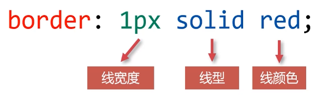
# 边框
# 边框三要素
# 边框属性三要素
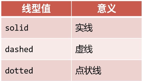
线形
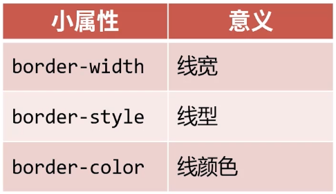
# 边框的三要素小属性
边框三要素可以拆分为小属性,用来覆盖大属性。即三要素小属性会覆盖大属性。
<!DOCTYPE html>
<html lang="en">
<head>
    <meta charset="UTF-8">
    <meta name="viewport" content="width=device-width, initial-scale=1.0">
    <title>Document</title>
    <style>
        section {
            float: left;
            width: 160px;
            height: 160px;
            border: 8px solid #000;
            margin-right: 10px;
        }
        section.spec {
            /* 用边框小属性覆盖大属性 */
            border-color: blue;
        }
    </style>
</head>
<body>
    <section></section>
    <section></section>
    <section class="spec"></section>
    <section></section>
    <section></section>
</body>
</html>
1
2
3
4
5
6
7
8
9
10
11
12
13
14
15
16
17
18
19
20
21
22
23
24
25
26
27
28
2
3
4
5
6
7
8
9
10
11
12
13
14
15
16
17
18
19
20
21
22
23
24
25
26
27
28
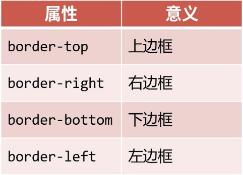
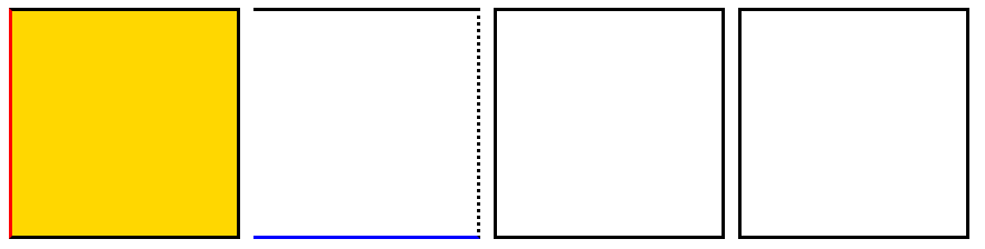
# 四个方向的边框
<!DOCTYPE html>
<html lang="en">
<head>
    <meta charset="UTF-8">
    <meta name="viewport" content="width=device-width, initial-scale=1.0">
    <title>Document</title>
    <style>
        .box1{
            width: 200px;
            height: 200px;
            background-color: gold;
            border-left: 3px solid red;
        }
        section {
            float: left;
            width: 160px;
            height: 160px;
            border: 3px solid #000;
            margin-right: 10px;
        }
        section.spec {
            border-bottom-color: blue;
            border-right-style: dotted;
            border-left: none;
        }
    </style>
</head>
<body>
    <div class="box1"></div>
    <section></section>
    <section></section>
    <section class="spec"></section>
    <section></section>
    <section></section>
</body>
</html>
1
2
3
4
5
6
7
8
9
10
11
12
13
14
15
16
17
18
19
20
21
22
23
24
25
26
27
28
29
30
31
32
33
34
35
36
2
3
4
5
6
7
8
9
10
11
12
13
14
15
16
17
18
19
20
21
22
23
24
25
26
27
28
29
30
31
32
33
34
35
36
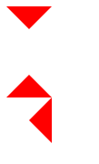
# (案例) 利用边框制作三角形
<!DOCTYPE html>
<html lang="en">
<head>
    <meta charset="UTF-8">
    <meta name="viewport" content="width=device-width, initial-scale=1.0">
    <title>Document</title>
    <style>
        .box1 {
            width: 0;
            height: 0;
            /* transparent是透明色 */
            border: 20px solid transparent;
            border-top-color: red;
        }
        .box2 {
            width: 0;
            height: 0;
            /* transparent是透明色 */
            border: 20px solid transparent;
            border-bottom-color: red;
        }
        .box3 {
            width: 0;
            height: 0;
            /* transparent是透明色 */
            border: 20px solid transparent;
            border-right-color: red;
        }
    </style>
</head>
<body>
    <div class="box1"></div>
    <div class="box2"></div>
    <div class="box3"></div>
</body>
</html>
1
2
3
4
5
6
7
8
9
10
11
12
13
14
15
16
17
18
19
20
21
22
23
24
25
26
27
28
29
30
31
32
33
34
35
36
2
3
4
5
6
7
8
9
10
11
12
13
14
15
16
17
18
19
20
21
22
23
24
25
26
27
28
29
30
31
32
33
34
35
36
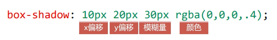
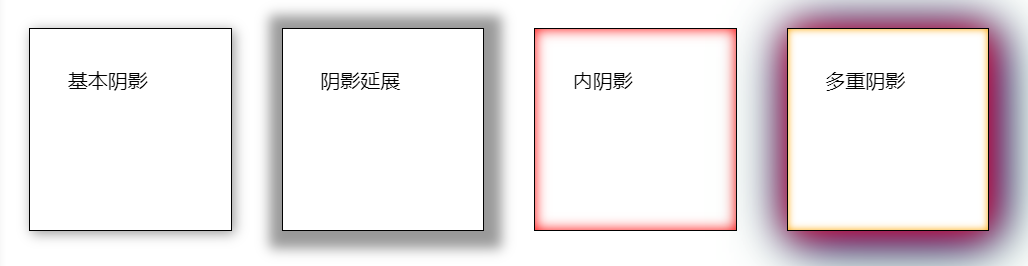
# 盒子阴影
box-shadow 属性来设置阴影
- 基本阴影
- 阴影延展:向阴影向四周发散
- 内阴影:向内的阴影
<!DOCTYPE html>
<html lang="en">
<head>
    <meta charset="UTF-8">
    <meta name="viewport" content="width=device-width, initial-scale=1.0">
    <title>Document</title>
    <style>
        div {
            float: left;
            margin: 20px;
            padding: 30px;
            width: 100px;
            height: 100px;
            border: 1px solid #000;
            background-color: white;
        }
        .box1 {
            /* 基本阴影 */
            box-shadow: 2px 2px 10px rgba(0,0,0,.4);
        }
        .box2 {
            /* 阴影延展 (12px) */
            box-shadow: 2px 2px 10px 12px rgba(0,0,0,.4);
        }
        .box3 {
            /* 内阴影 (insert) */
            box-shadow: inset 0px 0px 10px red;
        }
        .box4 {
            /* 多重阴影 (逗号隔开) */
            box-shadow: 2px 2px 30px red, 4px 4px 40px blue, 6px 6px 50px green, inset 0px 0px 6px orange;
        }
    </style>
</head>
<body>
    <div class="box1">基本阴影</div>
    <div class="box2">阴影延展</div>
    <div class="box3">内阴影</div>
    <div class="box4">多重阴影</div>
</body>
</html>
1
2
3
4
5
6
7
8
9
10
11
12
13
14
15
16
17
18
19
20
21
22
23
24
25
26
27
28
29
30
31
32
33
34
35
36
37
38
39
40
41
2
3
4
5
6
7
8
9
10
11
12
13
14
15
16
17
18
19
20
21
22
23
24
25
26
27
28
29
30
31
32
33
34
35
36
37
38
39
40
41
编辑 (opens new window)
上次更新: 2023/06/04, 12:34:19